June 26, 2017
A reader has hit your landing page, and now you need to convince them to take your book and possibly join your mailing list. Readers are thrown so many free books these days, just the offer of free doesn’t cut it anymore. So, what makes a reader click?
When a reader hits your page, they’re going to look at three things: your book cover, your tagline, and your book description. In that order, if you’re doing it right. If any one thing turns them off, they won’t click, and they’ll move on to the next free book. You have to entice them.
Let’s run down those three things for a minute. You need a great book cover, but you knew that already, right? Right? Your cover needs to be eye catching. It needs to accurately reflect your genre. The font, the colors, the title, the art, all of it needs to be telling the reader what’s inside.
Next, you need a tagline. A hook. A quick sentence that hints at the story within. Something that grabs the reader and makes them want to read your story. Don’t know what I mean? How about these?
“Be afraid. Be very afraid.” — The Fly
“We are not alone” — Close Encounters of the Third Kind
“A long time ago, in a galaxy far, far away…” — Star Wars
“Just when you thought it was safe to go back in the water…” — Jaws II
See what I mean? The tagline should be the biggest text on the page, and it should hook the reader such that they have to download your book and see what’s inside. Want to know what doesn’t work? How about these:

Does any of that convince you that you need this book? Does it tell you anything about Alice and her adventures? It’s an entirely accurate description of what will happen if you click the button, but it doesn’t compel you to learn more.
So, let’s try this again.
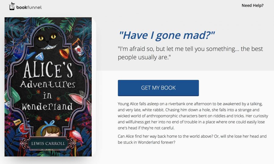
Ok, so we’re cheating a little because the first example uses our current landing page layout, and the second one uses the new layout we’re announcing today along with some of the new color theme options. But, still, let’s look at the elements. The cover is a lot stronger and hints at the absurdity and whimsy of the story. The large and small headings are quotes from the book that make the reader curious about what they might find inside. The book description gives them a bit of mystery and wonder.
The right elements on your page will all work together to make the reader’s eye move from one to the next until they get to that big button. And, if all of it works, they’ll click and give over that precious email address.
We’ve made up a few other examples using our new landing pages and some of the books from authors already on BookFunnel. It only takes a few minutes to design an attractive landing page that grabs a reader. Learn how easy it is to spiff up your BookFunnel pages right now.
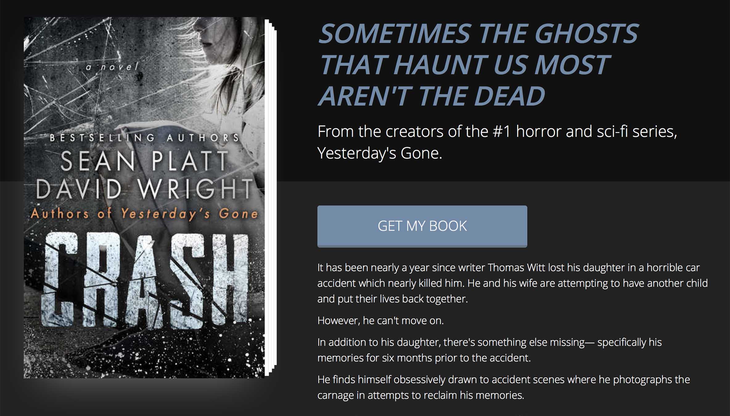
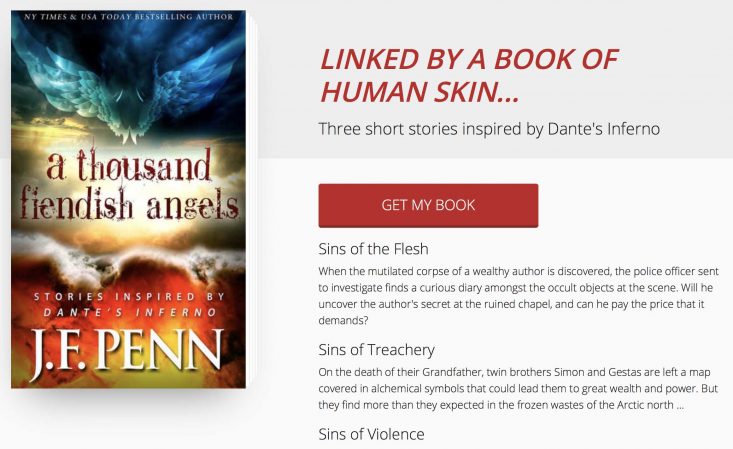
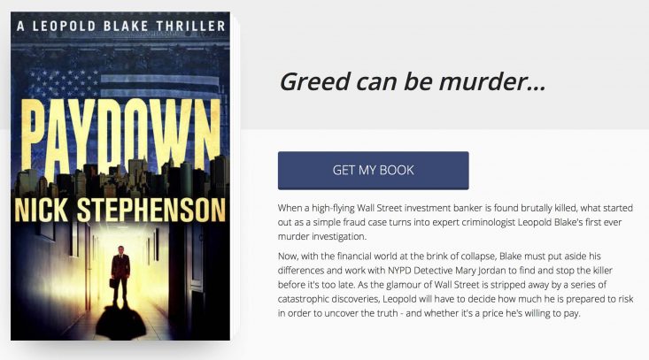
Wouldn’t you like your book pages to look this good? Yeah, you would! These new layouts are available to all BookFunnel authors today. Learn how easily you can update your landing pages now.
Never miss a post!
Follow the BookFunnel Blog and we’ll notify you when we have a new post.
